How psychology can help you succeed in product design
Can you imagine yourself on a track? Whether it’s an ordinary morning workout or you’re preparing for a competition, your every step brings you closer to your goal. Even if you’re exhausted, you keep going. The process, not the finish line, motivates you.
What does that mean? When you run, you don’t notice anything. You feel completely absorbed and still. You are caught in the flow.
That flow is familiar to all of us. You can feel it when you’re occupied by something you really like or when a task or job requires the most out of you.
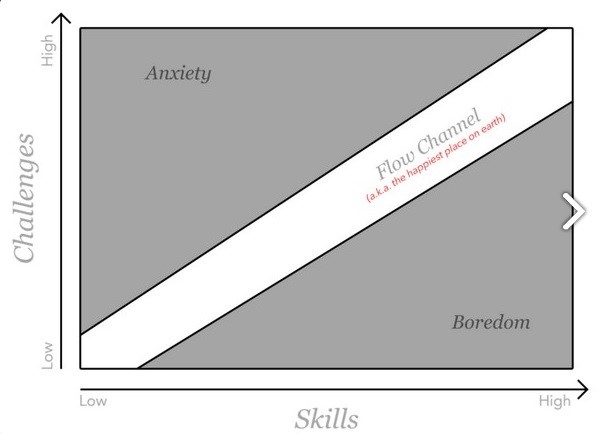
As you follow the flow, you enter into your own world. All of your attention focuses on the task. You no longer need outside motivation—you’re motivated by the process of solving the problem you’ve got. You overstep your normal productivity and you feel absolute pleasure.
How can you use this while developing a product? Just help people find the flow.
Any product is created to simplify our lives and all popular tools have one thing in common: you never notice when you use them, it happens unconsciously.
Of course, you can’t avoid difficulties, but they should be caused by the type of the task and not by the tool you use to get this task done. Your product should help people solve problems, not cause them.
Get closer to your customers
It’s not as complicated as it may sound. You just need to cut the semantic gap between you and your clients. Just look at your product from their point of view.

Listen to your customers! If some time ago you deleted some features, but your customers want them back—take heed. After all, it’s them who are using your product—not you.
Reduce the load
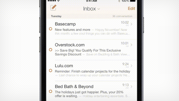
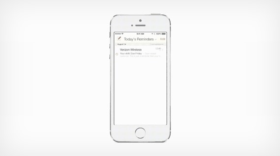
A successful program is a program that doesn’t require any extra action. Simplicity and convenience always win. Email service Mail Pilot allows users to set up a notification with one click and no other extra manipulations. Here’s how it works:
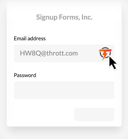
 Throttle also uses this principle and cuts down the time and effort needed to set up a new email. It automatically generates a new email with a special browser extension. The user just has to click the “submit” button.
Simplify the interface
It doesn’t matter how much you love surprises, your business is not a good place for them. When you work you want to be focused on a task and not on a tool you’re using. Gather the statistics, pay attention to the feedback, and make your product better and better.
Help people reach their goals
You start planning your way to a goal when you realize that this goal is achievable and real. Otherwise, you won’t take any action.

13,015 emails? No, thanks.
Mail Pilot solved this problem by showing the number of messages received during the day. Reading seven of today’s messages and 19 from yesterday becomes a manageable task.

Cut distractions
We live in an informational era and receive a lot of information every minute. Unfortunately, paying attention to all of it results in lost time. Help your customers separate useful information from trash and you will earn their trust.
This is how Mail Pilot does it:
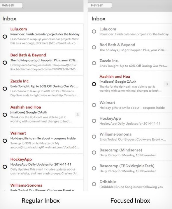
Regular Inbox Vs Focused Inbox
On the right, you can see how the app highlights the message sent by a real person. Messages with advertisements from different companies are visually put in the background.
Throttle went further. Instead of “patterning” ad messages, it just doesn’t allow them to reach the user’s mailbox.
Throttle also has a preliminary review function, which allows a person to see the main idea of the message and decide whether it’s something important or not.
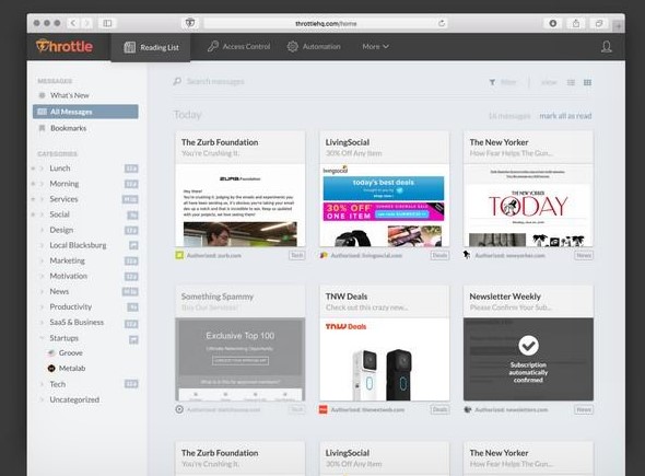
Talk to people
A simple way to win customers is to provide a rapid feedback. Communication is an easy yet extremely effective tool for your business.
Simplify the navigation.This one is very important for mobile app developers. If PC users won’t have much trouble finding what they need on a website with complicated navigation, mobile device users surely will. Mail Pilot lets you go back to the inbox anytime with just one click.Take a look:
 Throttle offers a special tab where you can see only new emails:
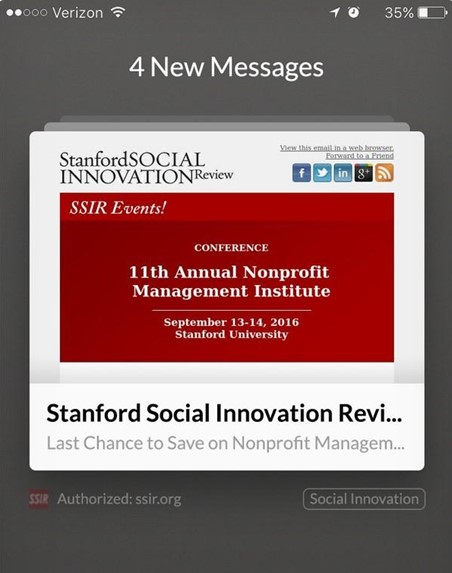 A good navigation system can always answer these three questions from the user:
- Where am I now?
- Where can I go from here?
- What can I find in the place I’m going to?
Conclusion
If you’re thinking of designing a new product, your main goal should be to understand how people want to feel, not what they want to see.


