Web Design Trends to Look For in 2018
Web design is a constantly evolving field. As consumer needs change, as tests evolve, as technology advances, we in the web design and development industry are pushing ourselves to meet and exceed new needs, adapt, and deliver new experiences for clients and end-users.
According to the NetCraft January 2017 Web Server Survey, there are over 1.8 billion websites around the world. Some are light years ahead of others. Whereas others are older, slower and unable to capture the attention of the audience they seek.
In our experience working with clients in 2017, we’ve seen design and style trends continue, and new trends and technology emerge that are going to shape how people experience the web in 2018. Here are seven trends we’ve seen clients ask for and how we think they will impact web design next year.
Front-end wow factor
Static sliders, videos, icons and parallax scroll are nothing new.
When your website looks the same as dozens of others in your sector customers stop taking notice. You need something new and interesting to stand out online.
Brands are working harder than ever to capture a customer’s attention. Animation on the homepage is one way to stand out. Web visitors stop and look, which if they like what they see, encourages them to explore the rest of the website, therefore making it more likely they will buy, or at least inquire to find out more.
Here is an example of a website NIX Solutions created using OpenGL for canvas animations.
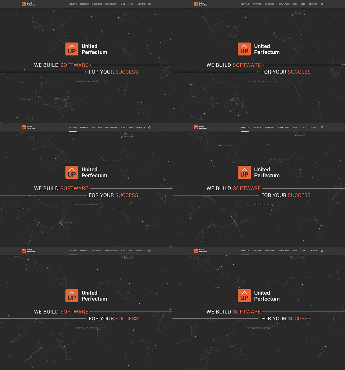
Using eye-catching constellations is a great way to emphasise the elegant and discreet corporate style of the company.
New layouts and navigational styles
Web visitors have come to expect three popular menu styles: top, sidebar, or scrolling.
There are times when trying something completely new is an effective way of capturing the attention of a web weary audience. One thing we tried for a client is a hidden navigation. This way, web visitors were encouraged to focus on a call-to-action while taking in the images, increasing conversion and reducing bounce rates at the same time.
In this case, for uPackingList, we used a horizontal scroll feature which helped increase loading speeds on a website that included a lot of images.
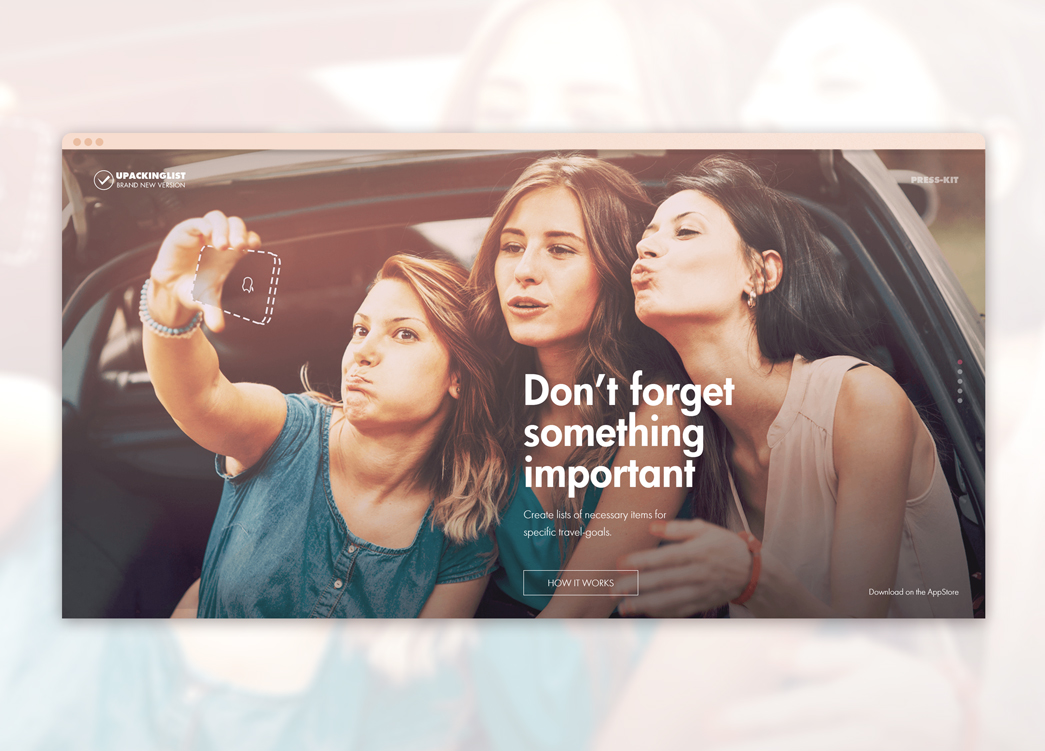
uPackingList: Makes packing and preparing for a move easy. We made it easier for them to convert new web visitors.
Bold geometric forms
Modern website are usually created with clean lines, squares and rectangles.
Older websites were clunky and unattractive but still designed on similar principles. For all the advancements in recent years, some things stay the same. And that’s fine, for most clients; but what about when someone wants to really stand out?
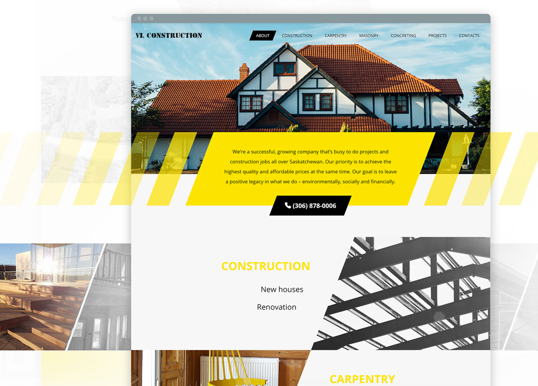
In 2017, we at NIX have seen more clients ask for design elements outside of the usual square and rectangle approach. For one project, for a construction company, we used diamond shaped blocks, making the user-experience stylish and structured in a way that encouraged them to move down the page, learn more and contact the firm for a building quote.
Bright colours
Colour impacts everything for web visitors. Colour can influence buyers moods and even whether they go ahead with a purchase.
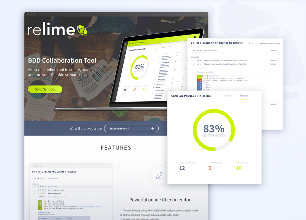
In recent years, we’ve seen pastel colours dominate. But now, people are moving towards bright and bold colours. One way to blend them, as you can see below, is to overlay a bright colour on a neutral or pastel background.
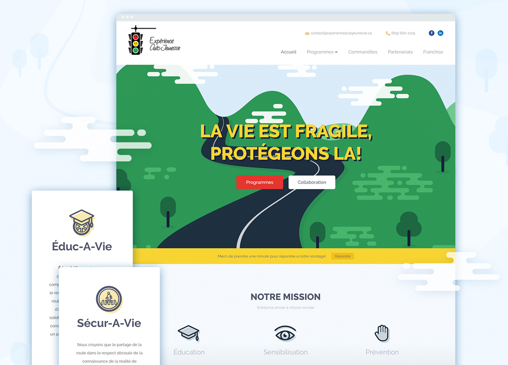
Customised icons and graphics
People absorb visual information far quicker than text.
Our brains are hardwired for visual inputs.
Unfortunately, when it comes to explaining a complex subject quickly, there are times when an image or video isn’t suitable. We use icons instead. Similar to consumers boredom with neutral colours and square templates, we are reacting more positively to icons that stand out and look different.
Icons are evolving. Designers have been adding details to visually revitalize them, but not to overload.
Authentic images
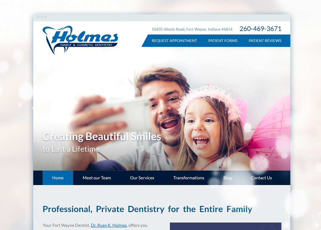
People react better to images showing genuine emotion. Especially when we are looking at images of people. We are psychologically equipped to identify fake smiles, fake shows of affection and emotions.
When developing and designing a website, businesses still use stock images providing they send the right message and drive forward the emotive story that creates an emotional connection between the business and customer. Take a look at the image below for a dentist’s website: it evokes the emotion that going to the dentist in this clinic is not scary, which is something children often worry about.
Animations: With purpose
Designers are increasingly using purposeful animations for better UX. Such animations explain a product, project or task visually and are proven to engage the users more than just text or simple schematics.
To keep the user’s attention, the transitions have to be smooth, simple and consecutive.
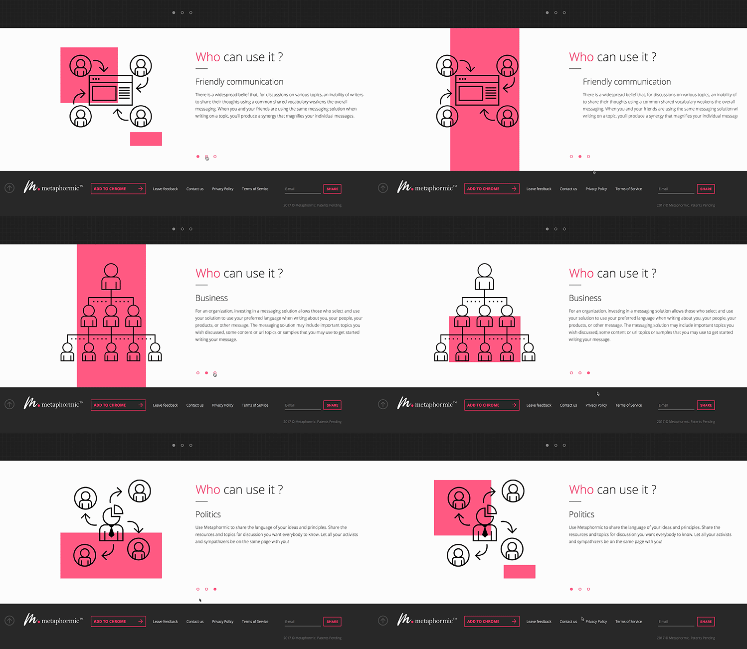
NIX animation for the Metaphormic project.
Key Takeaways:
- Take a different approach when it will benefit your business. Aim to stand out with animated graphics, geometric forms, bold colours and eye-catching icons.
- Make user-friendly navigation serve your purpose of increasing web visitor retention and conversion rates.
- Tell stories. Create visual connections and connections using copy with your web visitors.

